
For 5+ years, I have worked with branding. I have designed new logos, refined existing ones, and studied hundreds of brands.
Much of the work in designing a logo is about feeling; finding a balance and harmony while making the logo stand out and take its place. But are there any proportions that are more suitable than others?
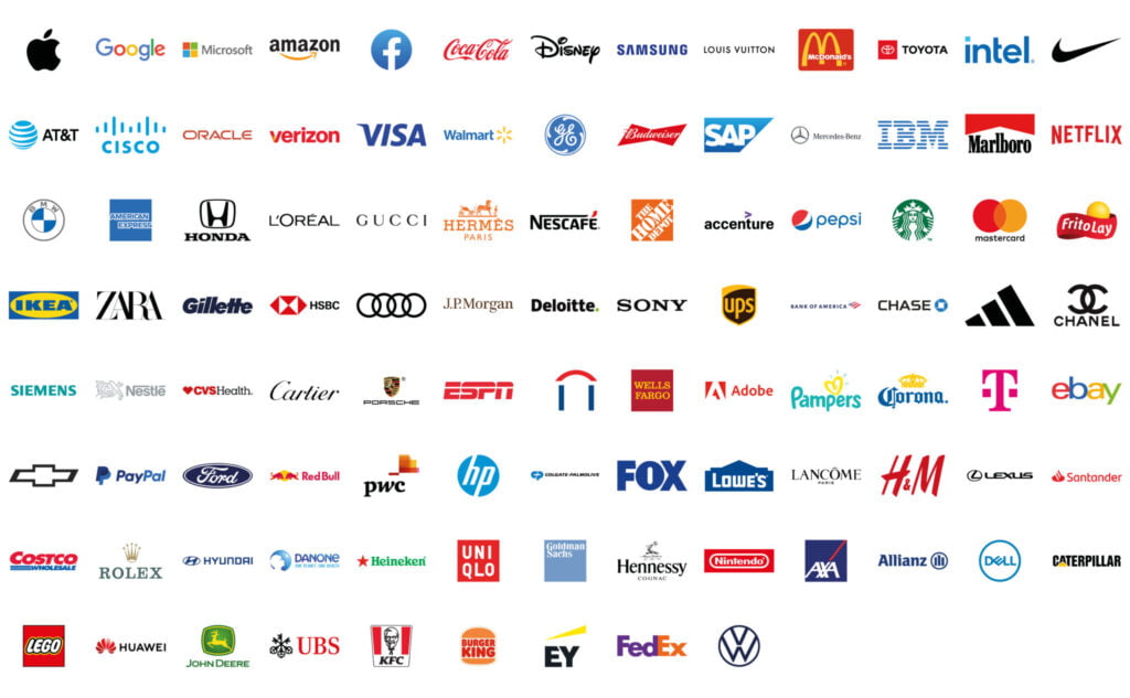
To find an answer to this, I downloaded the logos of all the brands on Forbes’ list of the world’s top 100 most valuable brands. Then I measured the width and height and calculated the proportions of each logo.
What are the most common proportions for a logo?
By grouping the logos based on their proportions, we can determine that (more or less) square logos are the most common; 21 percent of the logos have these proportions.
The next most common proportions are between 1:3 and 1:4.

Golden ratio as a proportion in logo design
A well-known measure is the golden ratio, which is said to create aesthetically pleasing designs. The golden ratio is approximately 1:1.618.
By examining 100 of the world’s most famous logos, we can conclude that very few follow the golden ratio. Only five logos are within +/- 4% of the golden ratio.
The golden ratio may appear in other ways, such as in a part of the logo design, but as a whole, the golden ratio does not play an important role in logo design.

Which are the best proportions for a logo?
By going through the logos of the 100 most valuable brands, we can conclude that the best proportions for a logo are between roughly square (1:1) and horizontal 1:4. 73 percent of the logos fall within this range.
Only five of the logos examined are taller than they are wide. In these cases, the deviation is quite small, and the logos are perceived as essentially square.
Only ten of the logos examined are wider than 1:6.
Why these proportions are best for a logo
A logo between 1:1 and 1:4 will work and be easy to recognize, interpret, and read in most contexts. From the small format in the website header, to the business card, work clothes, and the large facade sign.
When the logo becomes taller or wider, it tends to be more and more limited in its use.